Wednesday, July 29, 2020

Freshly Made Sketches #446


Have you fallen in love with slimline cards? I was so excited when Linda Callahan chose this shape for the sketch. What you do with it and the orientation is wide open, so have fun!

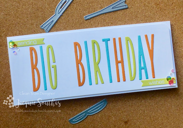
I took advantage of the longer card front to create a big text sentiment with The Stamp Market Skinny Upper Alphabet dies.


The sentiment is finished with "sending" and "wishes" from SSS Christmas stamps heat embossed on tags and placed in opposite corners. The other two corners are rounded for interest and a scatter of sequins add a festive touch.


I hope you are inspired by the Clean Team to play along with us this week!

Thanks for stopping by,

Jacquie
Wednesday, July 22, 2020

Freshly Made Sketches #445

Welcome to Freshly Made Sketches #445!


Jen Mitchell has designed a really fun sketch for us this week! I wanted a tone-on-tone subtle circle element and created it by layering a cloud stencil over a circle stencil, blending an aqua ink that matches the cardstock.


A Pretty Pink Posh Encouraging Greetings is stamped in teal and then a line of Spellbinders Birds on a Wire added. Two of the birds are popped up with foam adhesive for a bit of interest.


Check out the terrific Clean Team cards for more inspiration and play along with us!

Thanks for stopping by,

Jacquie


Wednesday, July 15, 2020

Freshly Made Sketches #444


I love the little offset strip in Jennifer Timko's fabulous sketch this week! The Hero Arts Layering Prickly Cactus die has been sitting on my desk just waiting for the a sketch to inspire me and was a perfect fit for a clean and simple square card.


The MFT Sweet Succulents sentiment is heat embossed on a conversation bubble and popped up over the cactus. A simple color strip in the bottom left corner balances the trio of sequin flowers in the upper right corner.


Check out the Clean Team cards for more inspiration and join in the fun this week!

Thanks for stopping by,

Jacquie

Wednesday, July 8, 2020

Freshly Made Sketches #443


Maybe it is a sign of the times, but the first thing I saw in Lee Ann's fun sketch was a martini glass. After playing around with a couple other ideas, I gave into my first thought and pulled out MFT Martini Time stamps and their martini shaker die set.


The glass is die cut from watercolor paper and a Zig Real Brush used to add the ombre color.  Another glass is die cut from a white panel to leave an opening for insetting the watercolored glass. Stamping the sentiment below the opening creates a visual triangle and balances the design. The last step is to pop the panel over a teal card base to seal in the sequins and glitter.


The design team has fabulous inspiration! I hope you will play along with us this week.

Thanks for stopping by,

Jacquie

Tuesday, July 7, 2020

CASology Challenge #371: POOL


The cue word was a bit of a challenge for me as I have a good collection of beach and ocean stamps, but very little related to a pool. After playing around with the Lawn Fawn Plan On It: Vacation words and images for a while, an idea started to click and I turned to the stash of paper pads.


A Carta Bella Soak Up The Sun pad (from 2015 😂) provided the perfect line of bathing suits in pretty, fresh colors. The design has the suits running on a diagonal line but it didn't take much work to capture a horizontal row. This section fit perfectly between the stripes on another paper in the pad. All that was left to do was stamp the sentiment above the designer paper strip and pop the panel up on the card base.


The design team has fantastic cards to inspire you this month!


Jacquie Southas (you are here)

Guest Designer: Claire!

Sponsor: STAMPlorations!


We are looking forward to seeing how POOL inspires you - just remember to keep it Clean & Simple! This is a one month challenge, so you have until 9 AM Monday, August 3rd (CMT) to link your card to the CASology blog.

Thanks for stopping by,

Jacquie

Wednesday, July 1, 2020

Freshly Made Sketches #442


I'm thrilled to be hosting the challenge this week! The sketch was created with a plan to use Taylored Expressions Big Bold Balloons stencil, but, of course,  you can use whatever shapes and images you want.

Does anyone else still marvel at the magic of combining primary colors to get secondary colors? I softly blended the Peacock Feathers, Mustard Seed and Picked Raspberry Distress Inks to create a translucent balloon bouquet, overlapping them to produce the green, purple and orange colors.


It's a bit hard to see the strings because I just wanted the softest touch of color. PTI Soft Stone ink was perfect for adding subtle Mama Elephant Party Kit images before finishing the panel with a PTI Penned Elegance birthday sentiment.


This could easily have been a one layer card, but I cut the panel and popped it up on the card base for a little extra interest.

The Clean Team has done an outstanding job this week. I hope you will be inspired to play along!

Thanks for stopping by,

Jacquie