Showing posts with label Papertrey Ink Blog Challenge. Show all posts

Thursday, April 25, 2013

Papertrey Ink April 2013 Blog Hop Challenge

The challenge for the April Papertrey Ink Blog Hop is to add a tilted element to your project.

Blog-hop-inspiration

I was thrilled to see a box of goodies waiting at the door yesterday afternoon and started playing with them immediately.


Now that I've tried the partial die cut technique, I just can't stop - I love the look!

Morning carpool is calling me, but I will be back later to see what everyone else has created this month.

Thanks for stopping by,

Jacquie

Monday, February 25, 2013

Papertrey Ink February 2013 Blog Hop

Eek, why didn't someone tell me that Monday is the 25th and that means the PTI February Blog Hop is today, not Tuesday? I'll tell you my messed up calendar story if you stick around to the end, but get to the Blog Hop first.

Nichole's challenge this month was to create something monogrammed. You can find the details over here at Capture the Moment.


February-Blog-Hop-Inspiration


There are some great inspiration photos, but I did a little bit of my own thing here.


These are monogrammed post-it note covers for a few crafty friends. 


Super simple to make, the wonderfully thick PTI Smoky Shadow card stock is cut & scored just a smidge bigger than the 3x3 post-its (or note pad) that is to be adhered inside. 

The monogram panel is made with the Headline Alphabet die, the circle from Hello Sunshine, a Nestabilities Label die and a PTI Half & Half die.

I wanted to create a really clean & simple cover, so used the bracket die from Headline Alphabet to make a notch to slip the end of the Half & Half die into to close the cover.

A little washi tape fits perfectly along the spine!

Now onto my messed up calendar story: my aunt from Scotland gave me a 2013 calendar that has Monday in the first column, running across to Sunday. Most (all?) North American calendars run Sunday through Saturday. I haven't used a calendar like this for a long time, but did grow up with them, so was able to adjust pretty quickly.

I have been referring to the Scottish calendar a lot over the last week or so, and when I glanced at my iCalendar and saw the 25th was in the second column, I mentally said to myself "blog hop Tues". Perfect, I can finish my little project Monday night.

With a few minutes between morning drop offs, I decided to check out the new Make It Monday and quickly discovered a Blog Hop under way! I thought I had an evening to finish off my monogrammed covers, so please ignore any stray glue bits that I haven't cleaned up.  It will be evening before I can head over & see what everyone else has been up to, but I am intrigued by the little sneak I've had while linking up.

Thanks for stopping by,

Jacquie


Friday, January 25, 2013

Papertrey Ink January 2013 Blog Hop

Welcome to the Papertrey Ink Monthly Blog Hop!

Nichole's challenge this month was to use black for the background of your project - if you didn't come from her blog, you can head over to Capture the Moment for details.


I have really been wanting play with an idea I had to use the Quatrefoil Cover Plate die to create a window card, so took some time yesterday to make this card.


Window cards are notoriously hard to photograph, especially if you are trying to line something up to be seen in a specific spot through the window, so bear with me as I show the card from a few different angles.

I used Smoky Shadow cardstock and cut 2 panels with the Quatrefoil Cover Plate die, poking 7 of the tiles out of the inside front panel and 13 tiles out of the outside front panel.  A few pieces of temporary tape helped hold the tiles I wanted to keep in place until the panels were adhered together. I also cut a 6.5 x 4.25" card base with a score line at 1" to create a flap.

The wrong sides of the die-cuts are adhered together, with a piece of transparency and the front flap sandwiched between them. Six of the tiles on the front of the card were replaced with tiles cut from Sweet Blush cardstock.


The inside of the card is finished with a Vintage Cream tile sitting on a Hibiscus Burst oval (I know it looks like a circle in the photo, but it really is an oval). This tile is stamped with a couple of the small hearts from the With All My Heart stamp set and lined up to fit in the center window panel.


Does anyone else have a container sitting on your desk temporarily housing little bits and pieces until you have time to put them away properly? Well, I do LOL, and earlier this week I finally tackled my overflowing basket. What a nice surprise to find 10 tiny pink gems hiding at the bottom! 

My search of the rest of my gems didn't turn up any more in this tiny size, but I did find a few slightly larger in an ever so slightly different shade of pink. I think they make the perfect finishing touch!


And here is one last photo from a different angle.

This card is also being linked to a couple of the challenges at Moxie Fab World: the Use 10 Different Embellishments Challenge and the Make a Card with a Window Challenge.

I'm off to see what else has been linked to the PTI Blog Hop.

Thanks for stopping by,

Jacquie


Wednesday, December 26, 2012

Papertrey Ink December 2012 Blog Hop

Thanks for coming by to check out my contribution to the Papertrey Ink December 2012 Blog Hop!

This month Nichole Heady challenged everyone to create a White on White card, providing these wonderful inspiration photos. If you didn't come here from Capture the Moment, head over there for details and links to join in the fun.


December-inspiration

The wall of frames in the bottom left corner was the starting point for my card. 


First I created a cardstock and white satin double ruffle ribbon frame - it is a ittle hard to tell in the photo, but this frame is popped up with foam adhesive and sits on top of the embossed base panel.

A Half & Half die cut provides a home for the gold heat embossed sentiment from the Mega Mixed Messages stamp set. This panel is attached to the ribbon frame.

To dress up the card a bit, I went to my stash of pearls, flowers and beads.


I touched a few of the petals with Glossy Accents and poured a little between the pearls and flowers. This is the perfect medium to hold clear beads and Martha Stewart crystal micro beads in place.


There is a little more contrast between the white ribbon & cardstock and the pearls & flowers than I was hoping for, but I still think it is close enough to White on White for the challenge!

My plan is to send this card in a padded envelope for my mother-in-law's 80th birthday next month.

I'm off to hop around and see what everyone else has created.

Thanks for stopping by,


Jacquie

Sunday, November 25, 2012

Papertrey Ink November 2012 Blog Hop

Yeah! I am back with my second post today, participating in the Papertrey Ink November Blog Hop.

This month Nichole Heady challenged us to take inspiration from cover art to create a project. She gave us these options to use, or we could come up with one of our own.


November-hop-inspiration


I hope you guess that I was inspired by the Liars poster.


I already had vellum out to use on the card I posted earlier today, and ribbons of color fluttering on the poster completely captured my attention and I knew I could capture their spirit with colored vellum.

I did start out layering free formed ribbons, but it just was not flowing the way I wanted it to.

When I went looking for a die that might work & found my Mega Gracious Vases die set, the design really came together quickly.


A piece of teal ribbon helps anchor the vases and a greeting from Birthday Bash Sentiments embossed in white on a Hawaiian Shores cardstock base finish the card.

I love that you can clearly see each vase and that there is such a range of color created by the overlapping pieces.

I am off to see what everyone else has done!

Thanks for stopping by,

Jacquie


Thursday, October 25, 2012

Papertrey Ink October 2012 Blog Hop Challenge

This month the challenge from Nichole Heady at Papertrey Ink is to move out of your comfort zone and use nontraditional color schemes to create holiday cards or tags.

Nichole put together six different color schemes for us to choose from. Well, I'd hoped to make gift tags last month for the September blog hop, but my Happiest of Holidays stamp set did not arrive in time. Did you know there are six stamps in this set? And Nichole gave us six color schemes to work with? Can you guess where I am going with this? I should mention that I also bought the Perfect Match Cardstock Sampler pack last month, so this means I have almost all the colors in the six color schemes.

I'll be honest here - I really like four of them. One color scheme I found very difficult to work with and the one I thought I liked the most going into the challenge is the tag I like the least.


Let's look at them one at a time compared to the inspiration photo.

Color-group-1

This is the first tag I made. I was reluctant to cut into my cardstock, so used designer paper from The Jillibean Soup Winter Tortellini  Spinach Soup paper pad. A die cut, few jewels and stickles finished it off.


Color-group-2

I knew this color scheme was going to be all about snowflakes. When we lived in Washington, dear daughter's winter coats were usually a pretty good match for Hawaiian Shores or Aqua Mist and her hat. scarves & gloves would likely be pink. Any photos I have of her playing in the snow are in these colors.

The large snowflake in the background was made a couple of years ago and has been hanging in the office. It is diecut plastic, colored with alcohol ink and covered in Martha Stewart coarse glitter. The smaller snowflakes are Martha Stewart punches and glittered with stickles.


Color-group-3


I am happy with this super simple tag. Die cut stars are layered around the sentiment and all the edges stickled (is that a verb?).


Color-group-4

I inked all the edges of this tag instead of using stickles - it has more of a homespun feel to it that I really like.


Color-group-5

This is the color scheme I found incredibly challenging - it just doesn't say "holiday" to me. I might have spoke too soon though, because one of my local scrapbook stores blogged about a new Collage Press holiday line that is in this exact color scheme!


Color-group-6

Sadly, I really like this color scheme, but need to do something to save this tag. I think this was the second one I made and when I came back to it after finishing the others I was too tired to try fix it.

Thanks for indulging the overachiever. I'm off to check out what everyone else has created.

Jacquie


Tuesday, September 25, 2012

Papertrey Ink September 2012 Blog Hop Challenge - Wine Gift Bags

When I first saw the PTI Blog Hop Challenge this month, I knew immediately that I was going to pull out the sewing machine and finally make a few fabric wine gift bags. The details of the challenge are on Nichole Heady's blog and this is the inspiration photo.


9-25-blog-hop-challenge


When the glitter settled from an epic couple of months making musical theater costumes for dear daughter's school I was left with a piece of heavy white canvas (denim?) that I thought might be useful in my crafty endeavours one day. 


I had enough canvas to make 8 bags, so have a few more to do, but I LOVE the way these turned out! 

If you have sewn a straight line before, you can whip these up pretty fast.

I used 12x18" rectangles, sewed the patterned fabric to the canvas first (right sides together leaving a gap on the bottom), flipped them right sides out and ironed the rectangle.  A channel was sewn for the pull cord (or ribbon) about 3" from the top edge - I picked out the stitches for the opening after this channel was finished. On one of the bags I added a line of gathered tulle - still debating whether I like this or not.


Because 2 of my fabrics had text on them, I was careful to make sure the text would read the right way when the top of the bag was turned down.

With the patterned side out, I folded the rectangle in half and sewed the bottom edge and side up to the cord channel, creating my bag. A different ribbon or cord is used for each bag and bells are tied on the ends of a couple - star or snowflake charms would be great too.

I used my ancient Making Memories foam stamps to print the sentiments. This was probably the toughest part - I had no back-up plan for any stray paint.


My plan was to make matching gifts tags using the new PTI Happiest of Holidays stamp set, but the PTI package is still somewhere between here and there, so I shifted gears quickly to plan B.

I will definitely be making a few more of the HAPPY bag, because it is the most versatile sentiment. What was going to be a Happy Holidays gift bag is now Happy Birthday! 


One of the PTI Half & Half dies is used to create a base for the sentiment from the PTI Movers & Shakers stamp set. The tag is made by running a piece of cardstock through the Xyron and laying the fabric on top of it. The excess fabric trimmed away and the corners rounded to mimic the Half & Half die.


A few rhinestones colored with a Copics and a piece of chiffon ribbon finish off the gift tag.

When my new stamps arrive, I will be making tags with them and scraps from these text fabrics.


I still can't decide whether or not I like the line of tulle on this bag.


I am off to check out what everyone else has linked to the Blog Hop.

Thanks for stopping by,

Jacquie


Saturday, August 25, 2012

Papertrey Ink August Blog Hop Challenge

I loved the inspiration photos from Nichole Heady's blog for this month's Papertrey Ink Blog Hop. Head over there and join in the challenge to use autumn textures, textiles & patterns in a project.


Blog-hop-1
Blog-hop-2

I put a few of my new PTI products to good use with this card.


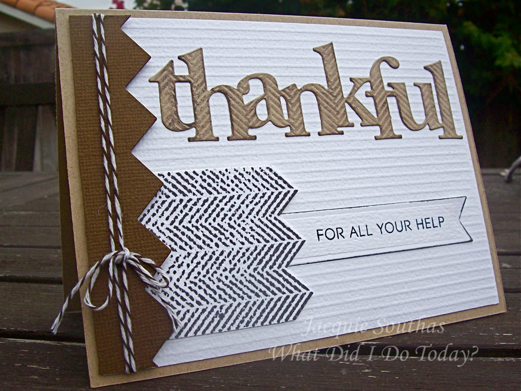
My first step was to score a white card base for a faux corduroy look. I die cut "thankful" from a piece of Kraft cardstock that had been embossed with the Herringbone Impression Plate. To enhance the embossed pattern, I lightly inked over the top of the die cut.

The stamped sentiment is from the PTI Thanks All Ways stamp set and is tucked under a small panel stamped with the PTI Background Basics: Herringbone Stamp Set.

A little Baker's twine and the leftover piece from a zigzag border cut round out the pieces that were used to put together this card.

Off to check out all the other Blog Hop creations!

Thanks for stoppng by,

Jacquie


Wednesday, July 25, 2012

Papertrey July Blog Hop Challenge

Something about the inspiration photo for the Papertrey Ink July Blog Hop Challenge made me think of my favorite Impressionist painters.

The soft colors, the blurred edges and that beautiful bouquet:

Blog-hop-inspiration


I decided to create my own impressionist style watercolor background:


First I die cut a panel using the PTI Library Card Tag die. It took many tags and tries and a good amount of time to finally get a color profile I was happy with.

I was using my heat gun to speed the drying between color layers so much that my dear son wandered into the office to find out what I was doing. Truth is, he thought I was blowing up an air mattress and wanted to know why.

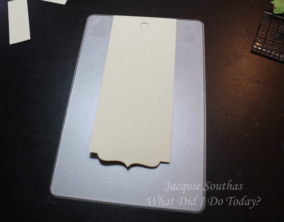
The sentiment tag is cut with one of the PTI Half & Half dies first and then taped into the Library Card Tag die to line up and cut the hole at the top of the tag.


The embossed sentiment is from the PTI Mega Mixed Messages stamp set.

Any one else still have a collection of fibers? These are Making Memories from their Beach Trims line from many moons ago.


Not only are they light & airy, they are the perfect color mix for this card.

The paper flowers are my least favorite part of the card. I did mix up the colors & style of flowers, but just feel they are a bit too rigid & formal for the dreamy quality of the rest of the design.


My bouquet is set on a green vellum doily - only the center of the doily is adhered, so there is some movement and lightness to the edges.

I'm off to check out the other links in the Blog Hop.

Thanks for stopping by,

Jacquie

Monday, June 25, 2012

Papertrey June Blog Hop Challenge

I was challenged by the color palette in this month's Papertrey blog hop challenge, but loved the idea of playing around with pleats and ruffles.

Here is the inspiration photo - more details on the challenge are found on Nichole's blog :


June-blog-hop

And what I finally came up with:


The stack of scrap paper was getting a little high on my desk, so I was sorting it when I came across a piece of older My Mind's Eye paper that had the colors of the challenge. 

I started playing around with the idea of a box pleat and cut a couple of 1.5" strips of this 12" paper. I played with a couple of scraps to figure out my score lines - even scribbled a pattern to follow.


Please note: nothing is to scale on that pattern LOL.

I put a little adhesive on the back of the folds to hold the pleats in place while I worked out the rest of my pattern.

I used a die from the PTI Half & Half Die Collection to create a frame for my sentiment.


The die creates a finished edge on one side and is open on the other, allowing you to make as long or short a cut as you want.

Because I wanted to create a frame, I took the fancy cut end and taped it to the die so I could run the piece through my Big Shot a second time and cut the other end.


Isn't that a cool little option? LOVE versatile dies & stamps!

My sentiment comes from the PTI Mega Mixed Messages stamp set and ribbon & pearls from my stash add the finishing touches.

Here is a closeup of the box pleat - each of the pleated strips is attached to the card base in the middle, with the ribbon covering the seam. I didn't attached the other end, allowing the pleats to open up a bit. All the corners are rounded to help soften the look.


I'm not happy about the way the colors are coming across in these photos - they are much closer to the inspiration colors in real life, but I don't have time to play with them now.

The chore I've been avoiding all day is still waiting for me, so I'm off to work on taxes.

Thanks for stopping by,

Jacquie